
Poor David Jones, he mocks Cannes and some unrelated crap gets put in the comments. It's new adgrunt Maikel mentioning his first ad.
Lets take a look at that ad, shall we?

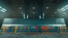
Hmm. Let me start by reminding you that white space does not communicate! For the love of Bernbach, what do you call that alignment? Justifucked? Is that Accident grotesque or scrawled sans? This is a poster, it should be legible from five hundred paces as the punter scurries past it trying to avoid it. The headline needs to be shorter - five words or less. The logo definitely needs to be bigger. There is no need to randomly capitalize words like "this" in that line, this is not German. You forgot the main selling point - 'what's in it for me' - the reader probably likes the peace and quiet of an empty ad poster.
Oh, and of course - it's been before, and better.

I'll give you ten points for media placement though, posting this unrelated comment to a post here got my attention and irked me enough to write this, so hey more eyeballs in the end, you're well on your way to getting a dream gig now. Good luck bubba! ;P
Adland® is a commercial-laden heaven and hell for advertising addicts around the world.
This advertising publication was founded in 1996, built on beer and bravery, Adland® now boasts the largest super bowl commercials collection in the world.
Adland® survives on your donations alone. You can help us out by buying us a Ko-Fi. Adland® works best in Brave browser


- reply
Permalink- reply
Permalink- reply
Permalink- reply
Permalink- reply
Permalink- reply
Permalink- reply
Permalink- reply
Permalink